Basic Flyer Design: First, Keep it Simple
“Everything should be as simple as it can be, but not simpler” -Albert Einstein

One of the first things I remember being told in my very first architecture design studio, is "Keep It Simple!" Simplicity sounds beautiful, but it is far easier to make a chaotic mess. Give simple a try.
A common approach to flyer design that I have observed is something of a collage approach. Have you started a flyer by creating a collection of catch phrases, contact info, clipart, and other potentially pertinent text and arranged it as best you could on a piece of paper - then called it good? This approach may get the general idea of what you are saying out to some people, but did it really achieve the objective you intended? Was the message clear? Did you even decide what you were really trying to say? Flyer layout is visual communication, and clear communication is important. Even if you are "just" a small business, church, or non-profit, putting your best foot forward and producing professional work should be a priority, regardless of your budget or number of staff.
So, what's to be done, since you didn't go to design school and you don't have the budget to hire a graphic designer? Well, you can learn some simple guidelines and implement them. The more you work at simplifying your concept and being precise in your message, the more you will see the results of your efforts. Initially, creating discipline in your layouts will take effort, persistence, and self-discipline, but the legwork pays off down the road.
1. What are you trying to say?
Decide on your central message. Say precisely that, and cut out the rest. As you add text to your flyer, continue to ask yourself if that particular item is essential to supporting your idea. Many times, the job of your flyer is to spark interest and direct your audience to seek out further information. Can you get their attention and then direct them to call, email, or visit a website? Yes, yes you can. You don't have to answer every question that may come up on the one flyer. You need only give the pertinent facts, share an idea, and encourage the audience to dig deeper. If this is an event, the typical "who what when where" could be addressed. Ensure the very pertinent content is there, such as contact info, and move on.
"Your goal then should be to pare down all of the necessary information into easily-digestible chunks. Throw out anything that you don’t really need and look for ways to make what you do need more concise." -Joshua Johnson, "How to Design an Awesome Flyer (Even if You're Not a Designer)", Design Shack
As you continue to weed through the information, continue to ask yourself "Is this essential to the one thing I am trying to say?" If yes, keep it. If no, it's out. The remaining information should be clear, concise, and necessary.
2. Decide on a specific, painfully simple, concept.
When it comes to a concept, the good news is that there really is nothing new under the sun. You do not need to invent a whole new concept for flyer layout each time you sit down to announce an event. Browse around online for layouts that others have used, and adapt the appropriate one for your purpose. I'm a strong believer in those little napkin sketch diagrams for organizing your thoughts. Perhaps you can sketch out two ideas that might work, and then give them a try.

Is it ok to emulate another design? Yes. Various types of layouts exist out there, there is nothing wrong with finding a good type to use and then artfully adapting it for your design. Beauty comes from being able to identify an appropriate type and using it effectively to communicate a clear message. It is much the same as house shopping. When house shopping in my town, you will be comparing various ranches, cape cods, farm houses, or simple Victorian houses. These are the types of houses available, and you select which one works best for your family. It is the same with flyer layout.
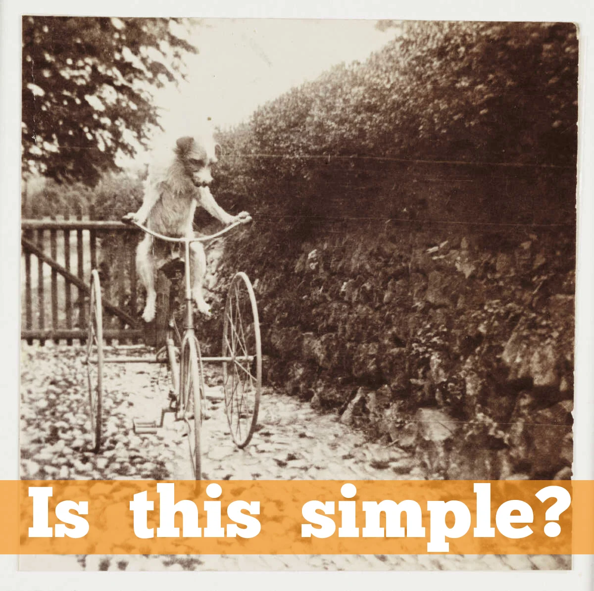
Be sure that you continue to ask yourself as you work, "Is this simple?" Selecting a complicated concept really will just end up being complicated. A simple design will involve more forethought up front, but will click when it's right. Your audience will more easily get your idea with a quick glance. The more you implement these ideas in your layouts, the better you'll get at selecting the appropriate types, and you'll probably have a couple of favorites that you just continue to adapt and use again.
Make yourself a set of rules that support your simple concept. Stick to those rules. For example, the diagram above is a visual set of rules for the concept. The orange area is where the image will go, with a bar of color across the bottom containing the big idea, and the details below. Sometimes, you need to adjust the rules as you go, but don't flat out break the rules. For example, you may decide to adjust your concept by moving the details onto the bar of color, because they are easier to read in that location. OK, but do NOT start putting contact information up in that beautiful clear area where your eye-catching image is intended to sit free and clear. Stick to your concept. Is it still simple? Is everything supporting what you are trying to say? If the overall concept you initially selected just isn't working, try another.
Examples
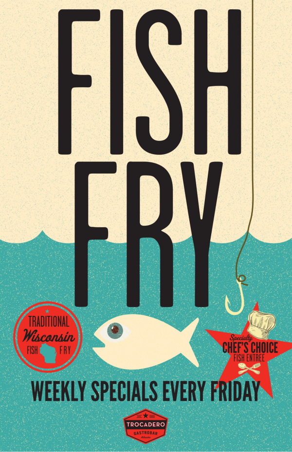
Take a look at this flyer from Trocadero Gastrobar in Milwaukee, advertising a Fish Fry.
Is it simple? Is the message clear?
Take a look at the flyer from Stone Creek Coffee below. This particular flyer needed to incorporate more information than the fish fry flyer.
How did they do? Is it still simple? Is the message clear?
As you are out and about in your community, keep your eyes open for the flyers that your local businesses and organizations are putting out there. Are they simple? Is the message clear? What can you take away from those designs, both good and bad? Keep a collection of the ideas you find, little diagrams of layout concepts and continue to work on your simplification techniques. You will soon find yourself equipped with a collection of tools and techniques that you can use again and again to effectively communicate your ideas.

Ideas? Do you have any favorite layout styles or flyer tips? Please share.
The next step: